
Not the sexiest topic, but it’s an elephant in the room we often prefer to ignore as designers. Working at frog design we often work for clients with a massive footprint and a diverse audience; very often it’s a requirement that the designs we deliver are fully accessible. Not only because it’s best practice but because there are legal requirements and it’s a serious threat for our clients getting sued because their products are not following accessibility guidelines.
Having your client sued for work you’ve done is not something I strive for 😉
So let’s try to prevent this from happening.
I’ve distilled my experiences regarding accessibility in a couple of insights, best practices and helpful tools. The aim of this article is to help you apply accessibility in the beginning of your future design processes.
Lesson one
It’s not hard. Keep accessibility in mind from the beginning of your design process.
Audience
Accessibility affect 19% of the population in the US. (Which has a relatively low disabled rate compared to developing countries.)
Of that 19%, 54% uses the internet regularly. That’s around 10% of the population. I got these insights from this podcast. I highly recommend it. It’s a great listen.
Why
We should design experiences and products so users requiring greater accessibility are better able to see, hear, use and understand the products we are building.
Accessibility broken down.
My colleague Jeff Weir explained accessibility to me in a brilliant way.
Support and empathy for accessibility can also be created by framing it in terms of:
1. Problem
2. Solution
3. Unexpected gains
4. Completely unexpected tangents
Let’s apply this to the physical world. Let’s take curbs as an example.
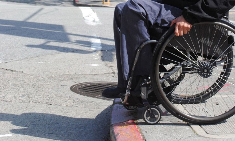
1. Problem:
Impassibility for wheelchair users:
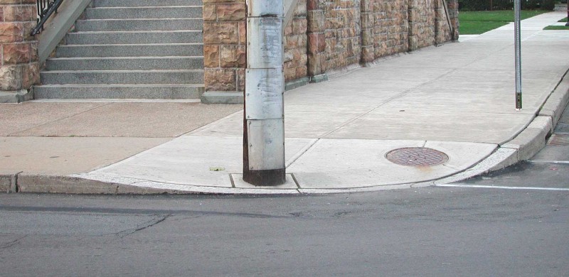
2. Solution:
Curb cuts. Curbs are now passable for wheelchair users:
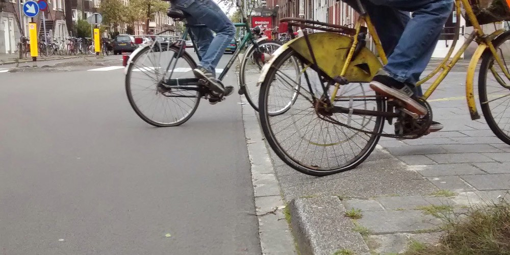
3. Unexpected gains:
Ease of use for other wheeled users like strollers, delivery carts, and bikes. Even walking is more pleasant.
4. Completely unexpected tangents:
Curb cuts as launch ramps for skateboarding. Back in high school, my friends and I would hang out at particular curbs because they were such good ramps. Unexpectedly, designing for accessibility resulted in social spaces (or loitering depending on your perspective)

”Everyone benefits from accessible design in unexpected ways.
How to apply it in our digital work?
Make links more descriptive.
A screen reader becomes useless when it’s just saying “read more” whenever it’s reading the links. Making this more descriptive will also have positive effects on your SEO results.
High contrast colours.
I’ve worked for multiple clients where we had to follow level AA accessibility standards which means a contrast of 4.5:1 for normal text and 3:1 for large text (14 point and bold or larger, or 18 point or larger). We go more into tools to check this further down in this post.
I’ve had experiences in the past where accessibility was checked by somebody who was specifically hired to do this. Everything we designed that didn’t follow these standards came back to us and had to be redone.
In some cases even the main brand colours of the palette are not fully accessible, this drastically limits your ability to use certain colours. We often make an overview of the colour palette and highlight the accessibility rules. This is perfect to keep line of sight to which colours we are able to use in combination with each other or with which different type sizes accessibility keeps holding up.
At the same time the link colour of Apple.com doesn’t pass the test and also the main brand colour of Airbnb doesn’t succeed. Obviously both these companies don’t seem to suffer from it…
So where do we draw the line as designers?
One way would be the following:
Design in monochrome and for colourblind people.
The Mac app Sim Daltonism makes this really easy. Obviously you don’t leave this on the entire time but it’s interesting to check every now and then while you’re designing. Especially early on in the process.
Include alt tags in images.
This is more technical but it will make sure screen readers will have a description for the image. This again also helps your SEO.
Use tab and arrow keys to navigate through interactive elements.
Also more technical but a essential step when you are in the final stages of the process and you’re checking how your designs are implemented
Tools
Sim Daltonism
Mac app to view different types of colourblindness or monochrome.
Tota11y
A javascript plugin that points out on element level if it’s passing accessibility or not.
I hope this article was of any help. Feel free to shoot some feedback or ask me any questions.Some of the info above came from this awesome podcast.
I thank Antonello for pushing me to write this blogpost and Andrew for checking it on typos
This blogpost was initially posted on www.medium.com/accessibility