PlantDemand is an expert tool, helping asphalt plants with their supply chain management. In the past pdf exports of excel sheets had to be emailed around to keep track of changes. PlantDemand keeps the entire team up to date through a single online environment as a responsive website, iSO & Android app. The goal is to redesign the complete tool and optimize through user testing.
The Dynamics
PlantDemand is a project we work on with a completely remote team. We have weekly calls to talk about progress, identify what needs to be done and flag blockers. Once a year we meet in person to discuss long term strategy.
The team
Daniel Mekis: Subject matter expert and sales. He makes sure the business requirements are always taken into account.
Dennis Schaaf: Full-stack developer with a deep understanding of the design process and scrum workflow. (a former colleague at frog)
Me: All-round designer, UX researcher, and occasional front-end dev.

user journey mapping during our yearly meetup in Lombok
Outsourcing
We can’t execute in the speed that we would like to with just the core team. Therefore we are outsourcing part of the work in fixed scope fixed budget projects. We got one external team building our Android app and another react team building the web redesign.
We set the scope by:
- Writing user stories in Jira
- Create a definition of done
- Add design in the user stories
- Add animation studies in Jira when needed
- Create one Figma art-board with everything in the scope.
- This also caters for redlines since anybody can inspect the design
The approach
PlantDemand is a tool that was built and designed in code in 2014. It started with an MVP with just a few features. The amount of features has organically grown over the years. This means that some of them are not living in the ideal place anymore and the overall interaction & visual design can use a revamp to be future proof. We’ll also take some existing feature requests into account.
Goal: Refresh and improve. No need to reinvent the tool cause the core is good. Just make it stand the test of time while doing subtle restructuring in the IA and navigation model.
How Might We
Restructure PlantDemand to improve the interaction & navigation model?
Update the look and feel without the existing users feeling lost?
Create a cross-platform tool that looks and feels like it belongs on every platform?
The process:
Gathering data / Immersion
- Survey Monkey questionnaire
- Data-driven decisions using Google Analytics
- Gathering existing feature requests
- Opportunity area mapping on the old design
Execution
- Interaction design
- Visual design
- Cross-platform approach
- Light rebranding
- System thinking
Validating
- Prototyping
- User testing
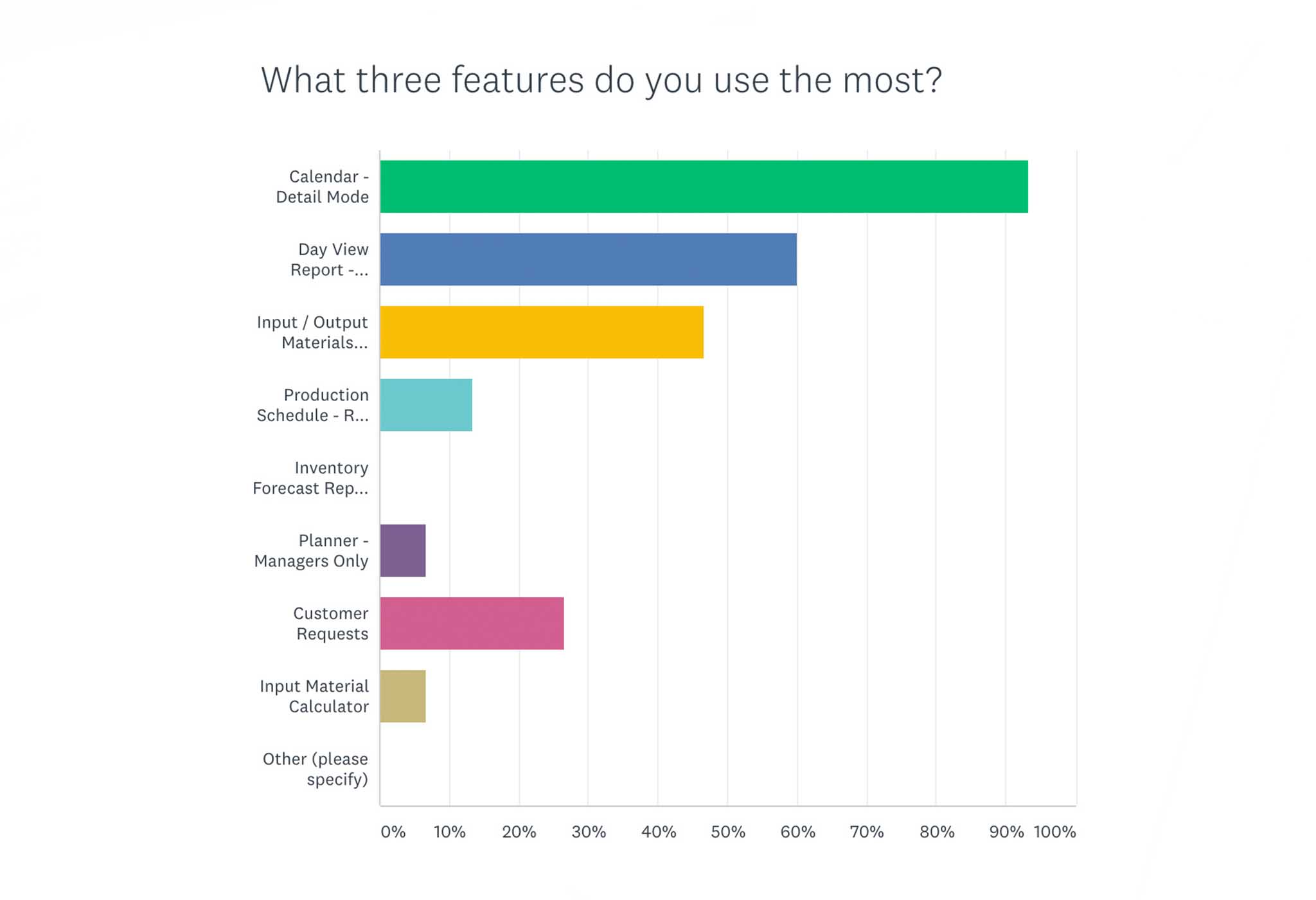
Survey insights from our customers
Data Driven Decisions
Analytics is very important in any website but especially in an expert tool. It has helped me define priority in places that would otherwise be impossible as a non-user of the tool and non-expert of the asphalt industry
Some insights:
- The default view of the calendar (From compact to detailed)
- Order of the “add note” categories
- Understand where in the on-boarding users leave the flow
Opportunity area mapping on the old design
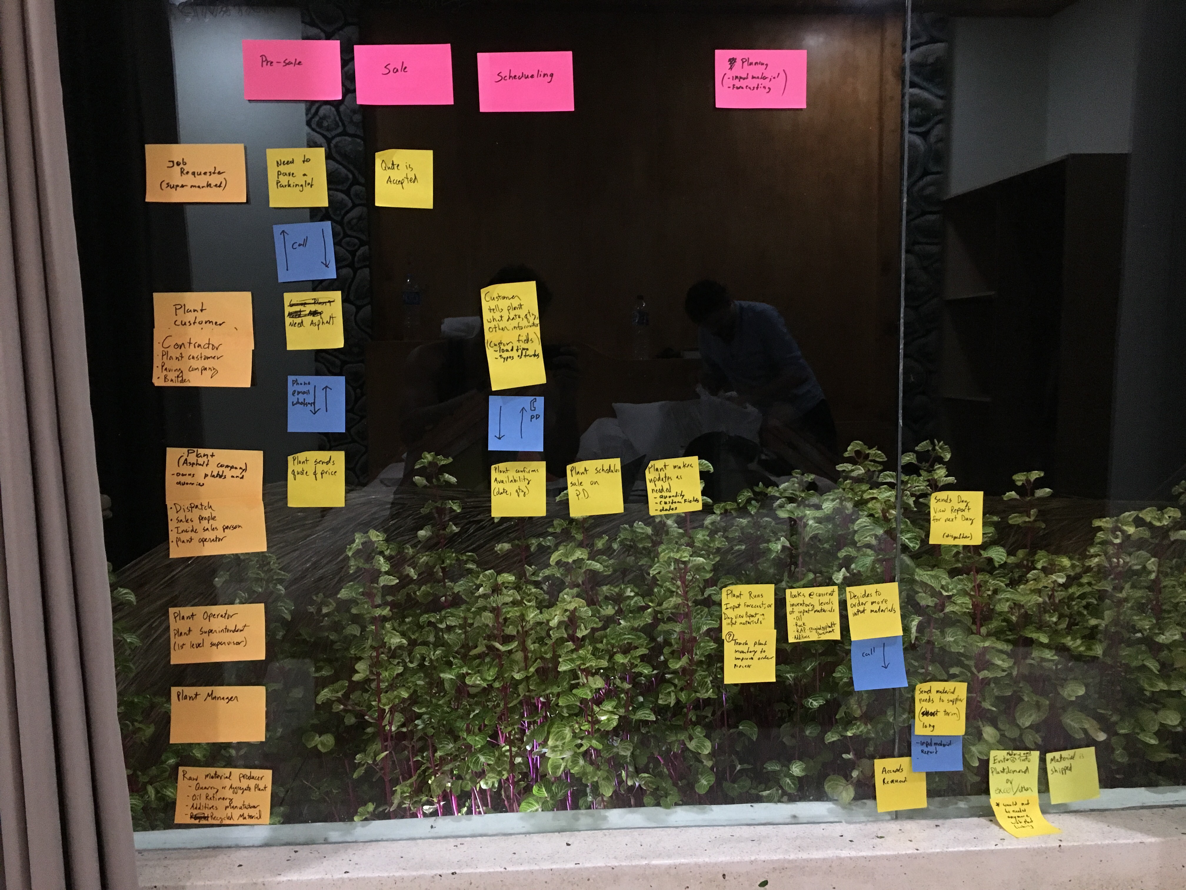
Based on all the information that came in from the survey, Google Analytics and existing feature requests and previously gathered data; I started mapping out opportunity areas on the existing design. This was used as a starting point for restructuring the existing IA and the ideation sketches for the navigation model.
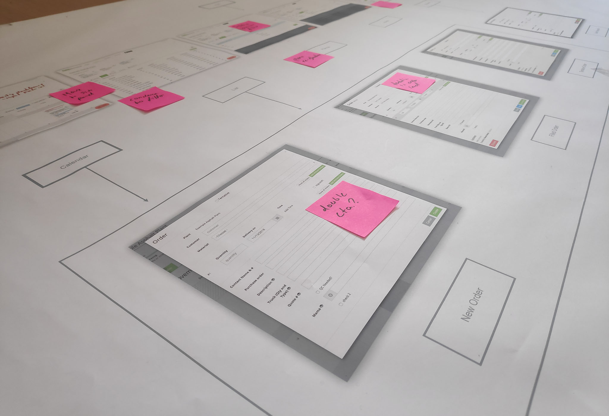
Created print-outs of the old AI with the old design to identify opportunity areas
Interaction design
Based on all the gathered information I started to rethink the existing IA and the Navigation Model. I focussed on keeping a clear hierarchy between the first, second and third level navigation. Here are a couple of things I kept in mind while sketching ideas.
- Create less distributed settings (global, plant and account settings)
- Users value high information density
- Shorten the on-boarding flow
- The detailed calendar view is used more frequently than the compact view
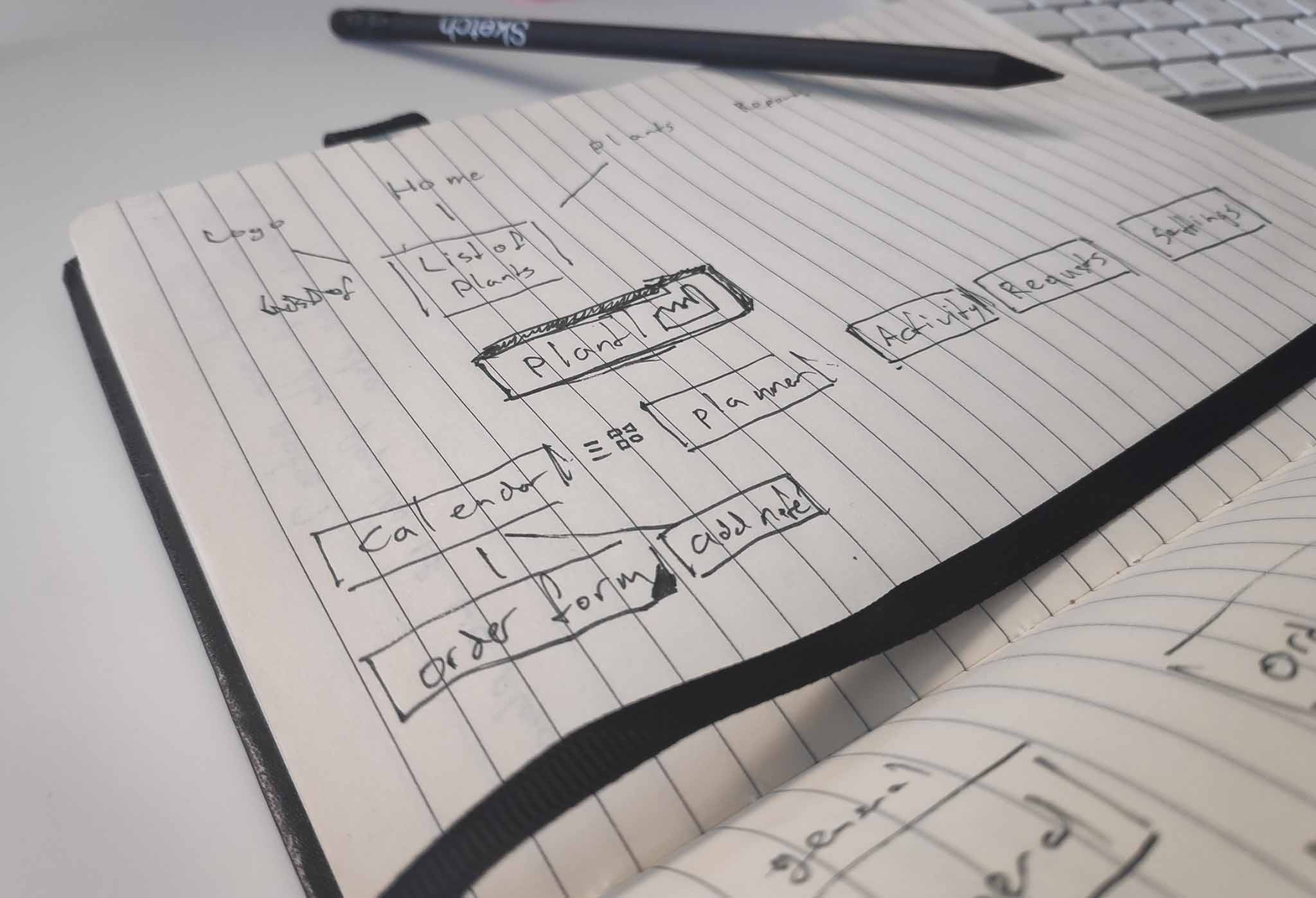
Rethinking the IA
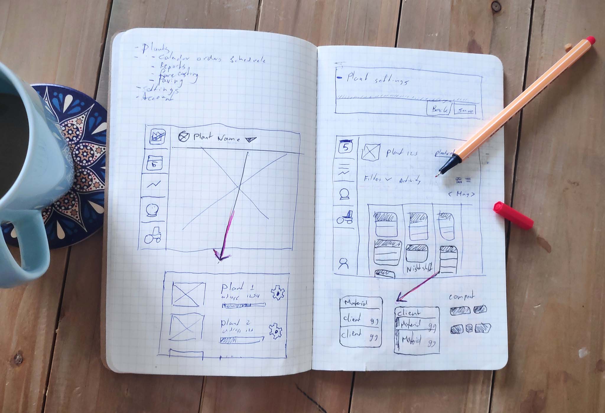
Early sketches on how to solve the navigation model
For the mobile apps, it was a bit easier to create the IA since we offer a lot fewer functions in the app. That’s why I created the IA in combination with the screen design. This helps the third party development company to wrap their heads around the app.
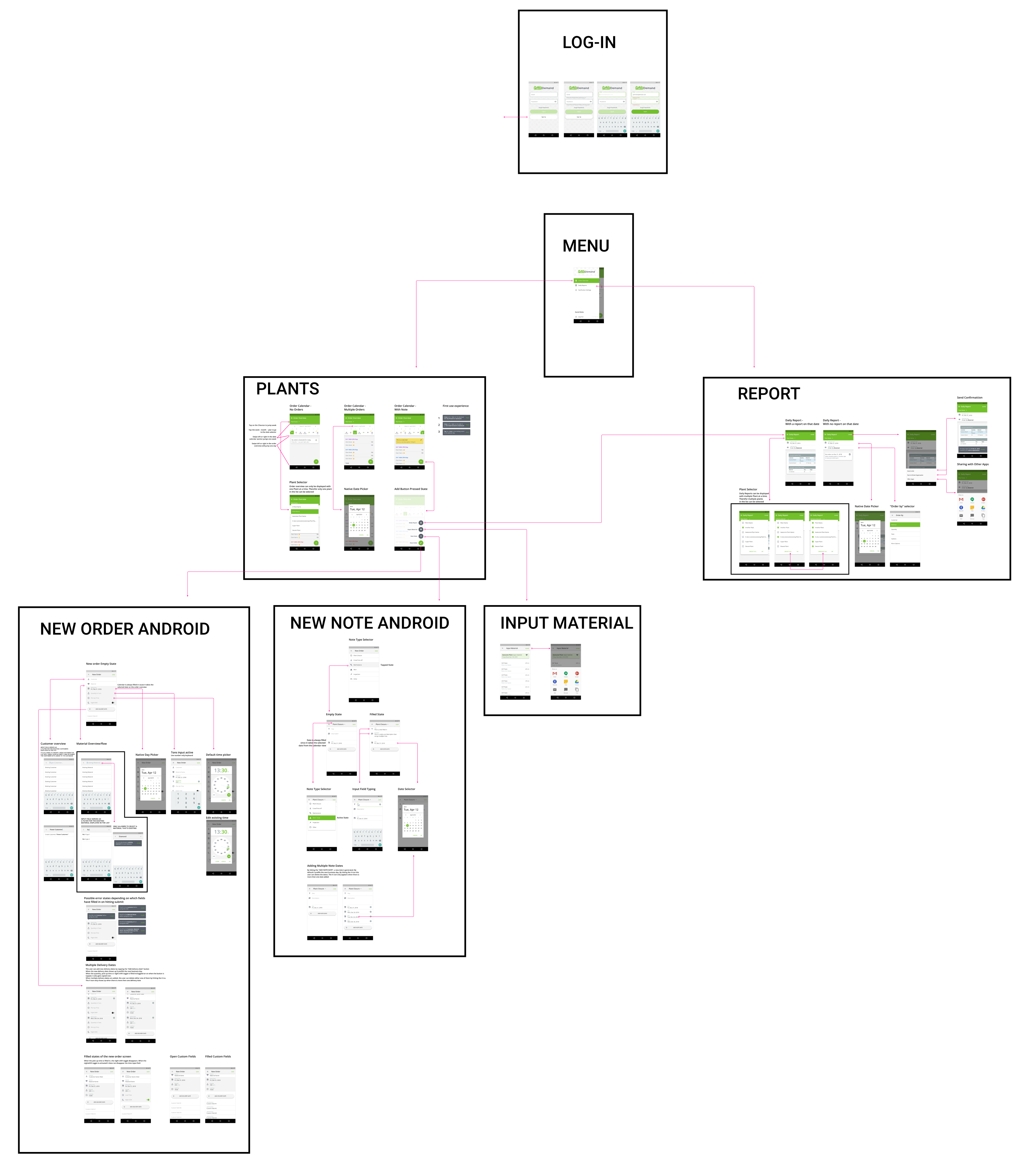
IA in combination with the “final” design in Figma for the Android app
Visual Design
The PlantDemand team did some 2 x 2 mapping to identify the visual design direction by looking at different online tools. These tools are not related to our industry but they were purely looked at from a look and feel point of view. This resulted in a visual design that is minimal, clean yet playful in the details. I also did a light rebranding of the logo (more on that later). As the design matured I had to think about animation studies as well. I ended up with quite a high navigation bar with the filters. How would this scale down to tablet and mobile? Will it change in height? Which part is sticky? Some answers to those questions can be found in this animation (build in Principle):

Cross-platform approach
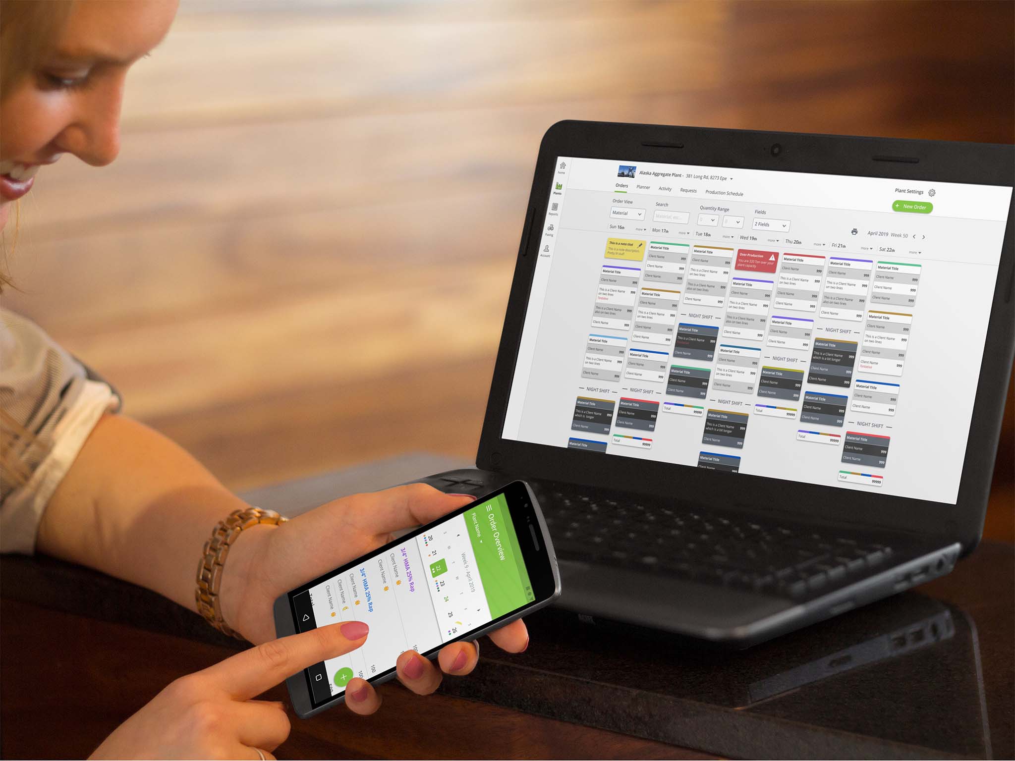
PlantDemand is represented as a responsive website, Android app and iPhone app.
For the website, I’m designing desktop first but I’m making everything scale down to the phone. For the app design, I’m trying to stick to native elements to stay close to the ecosystem that the user knows. This also makes development easier and less expensive since we are outsourcing the apps. Some functions are reduced on the phone. This same strategy applies to the apps. We try to minimize features in the apps. For the following reasons, the needs of the customers are different when they are not in the office:
-
- Focus on consuming data instead of editing.
- Fewer features = more focus, therefore it becomes easier to use on the go.
- Complex tasks are often executed by office roles. (e.g. sales)
- A responsive website on the web is a backup.
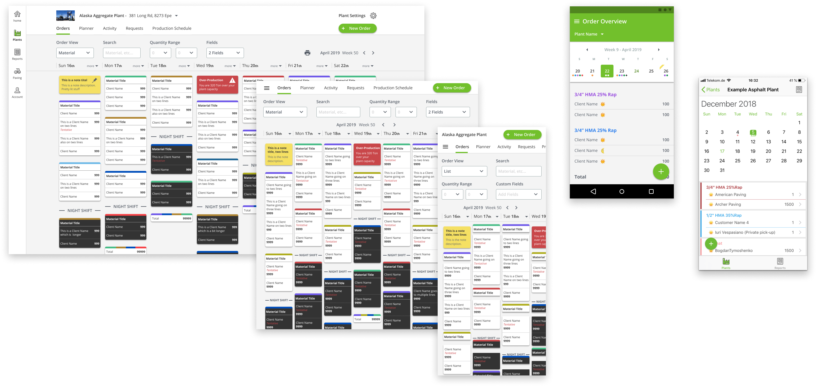
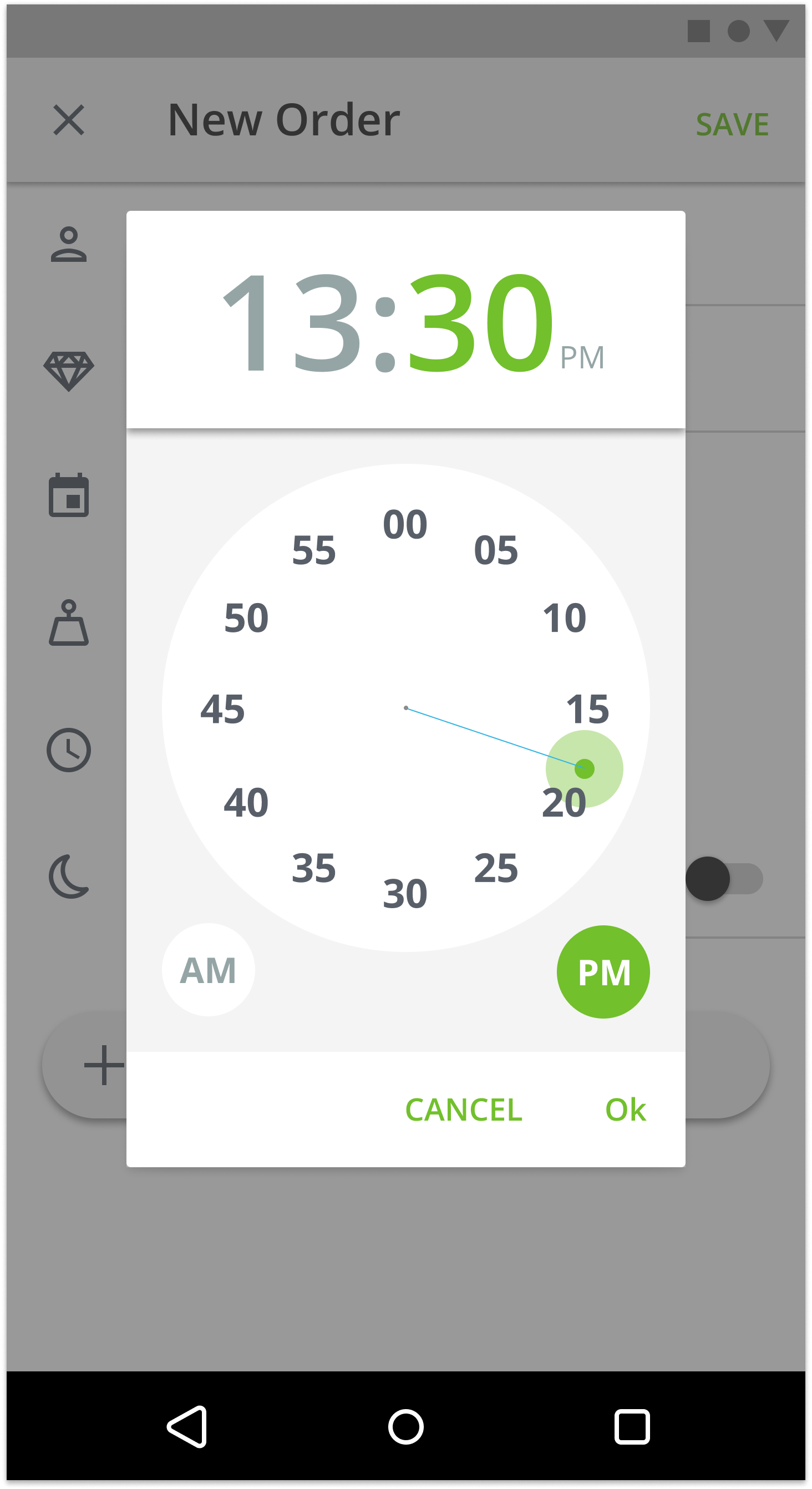
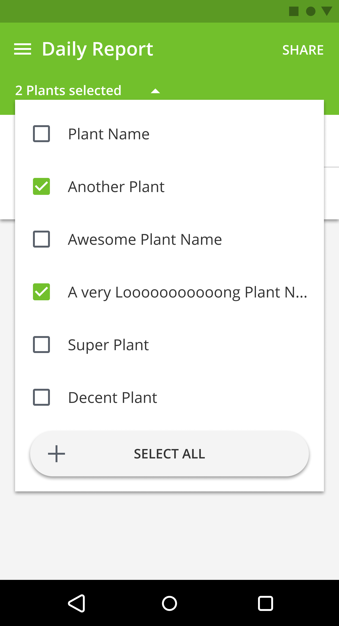
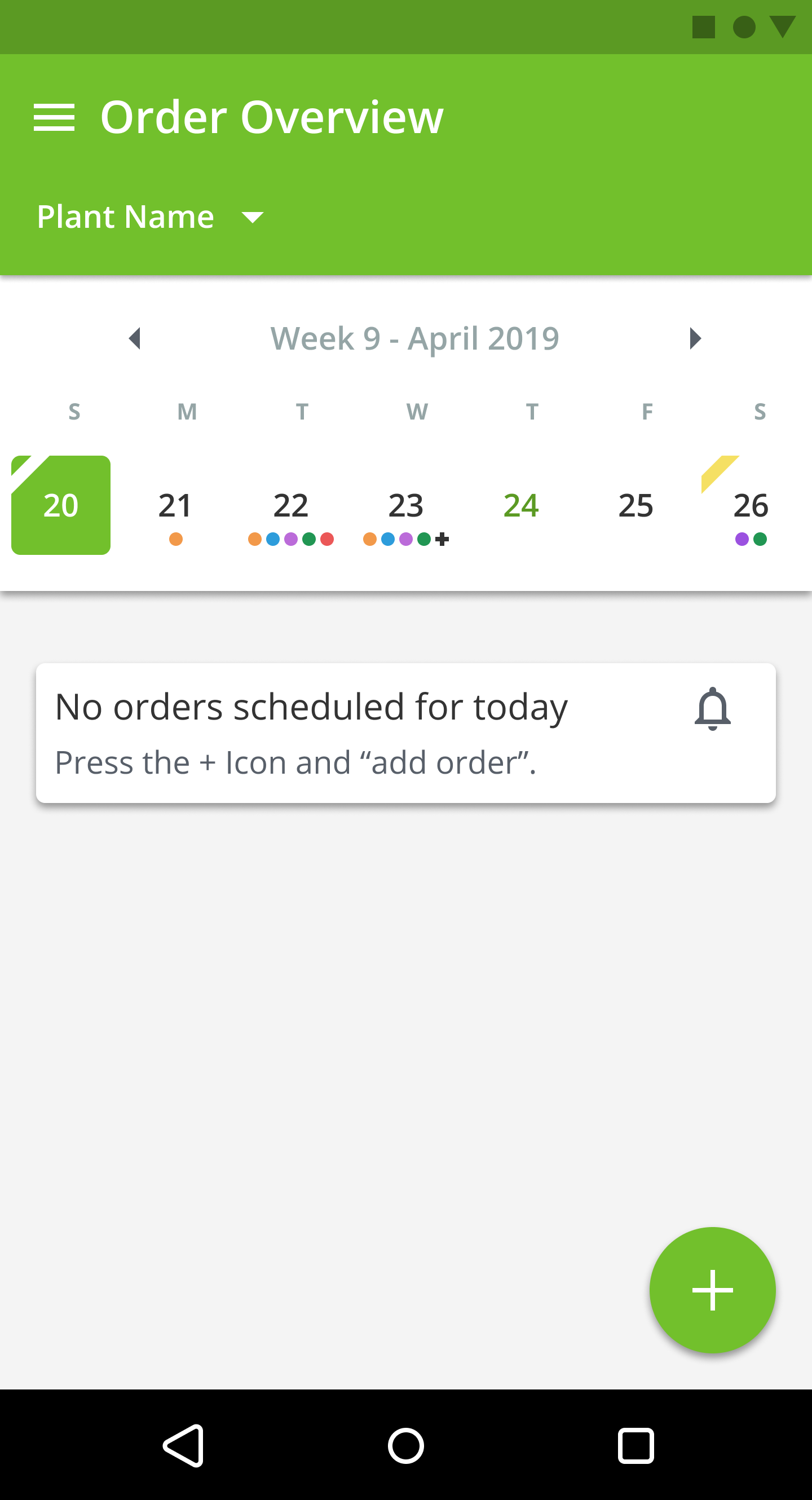
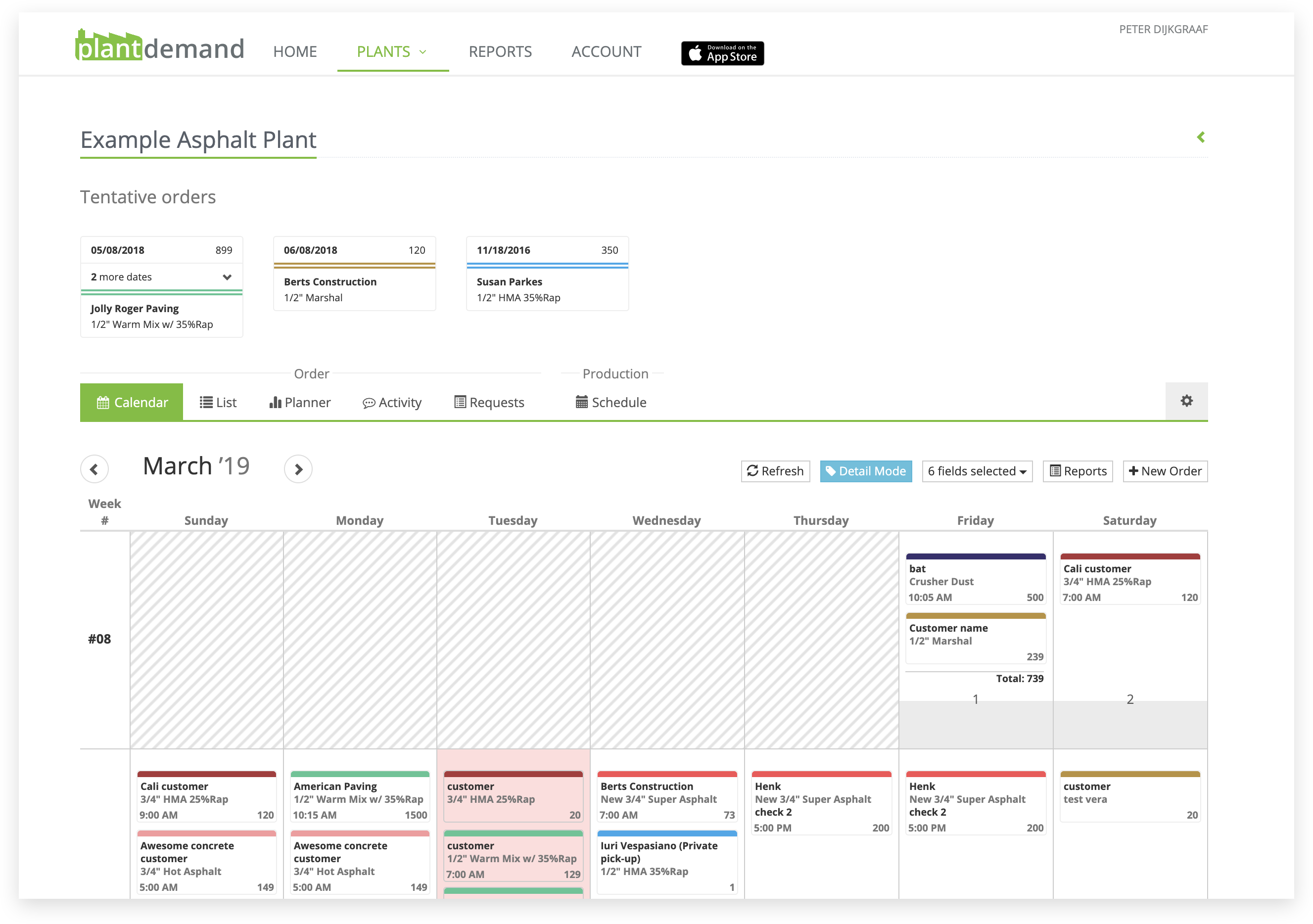
Order Calendar View for responsive web, Android & iOS
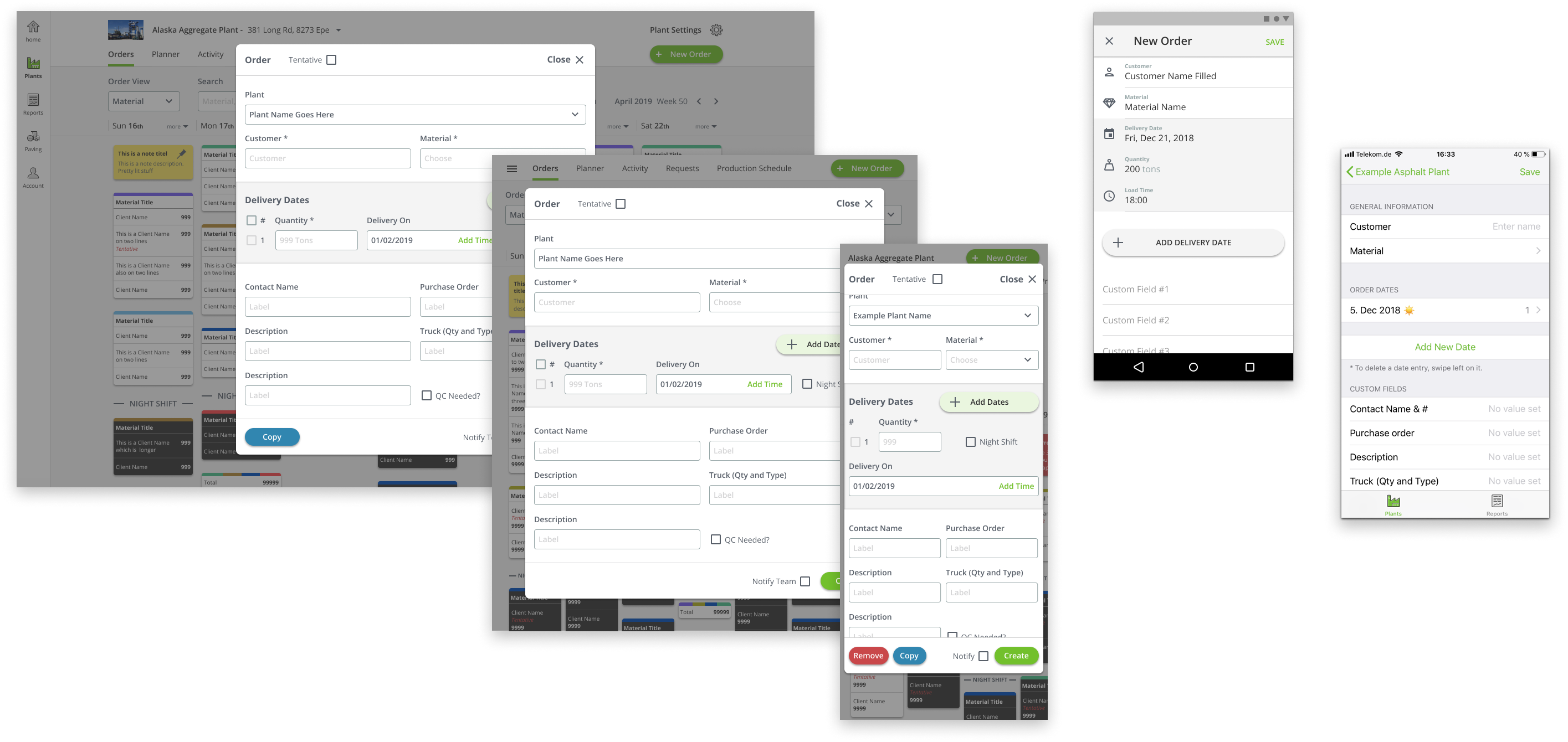
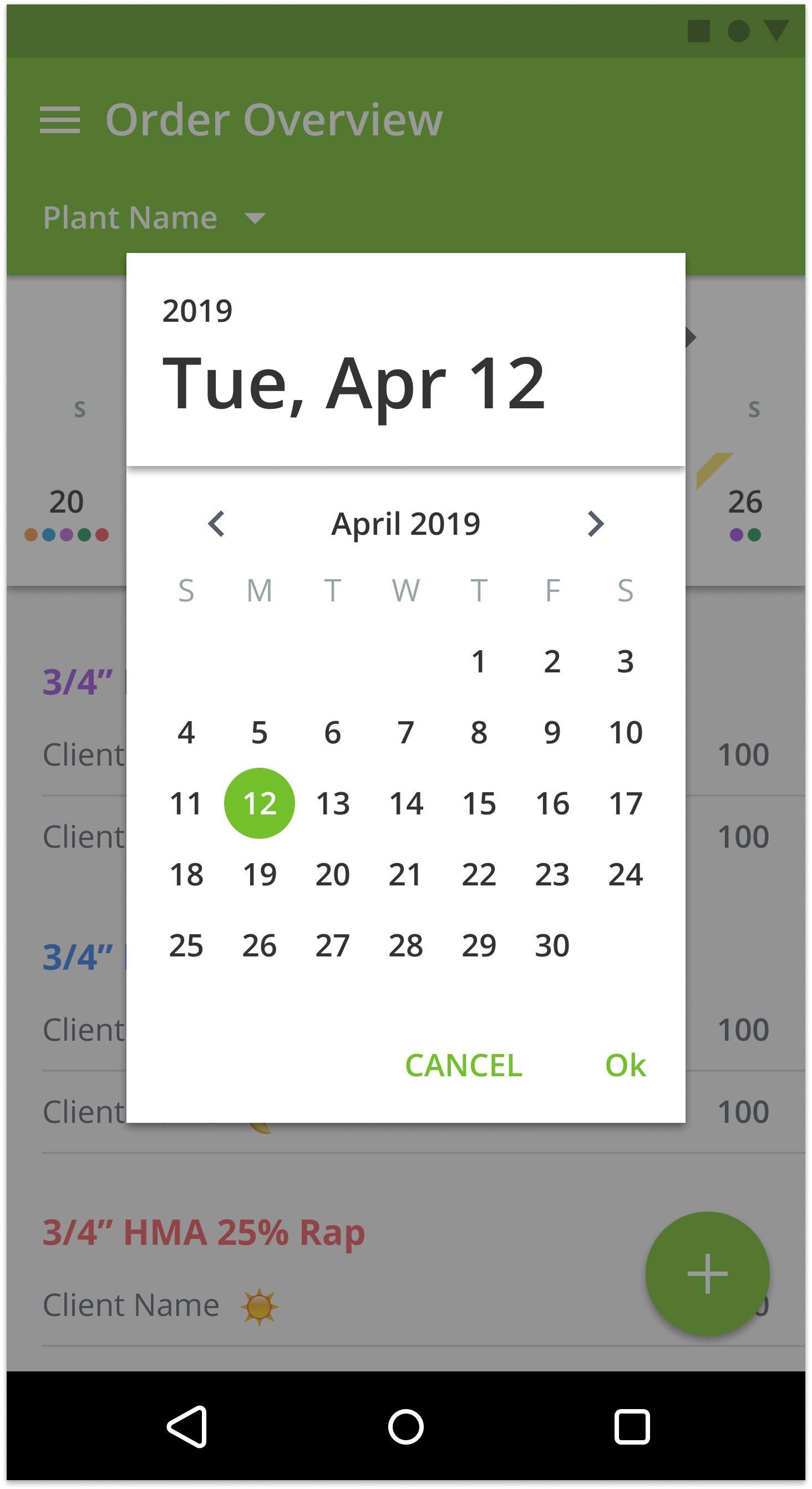
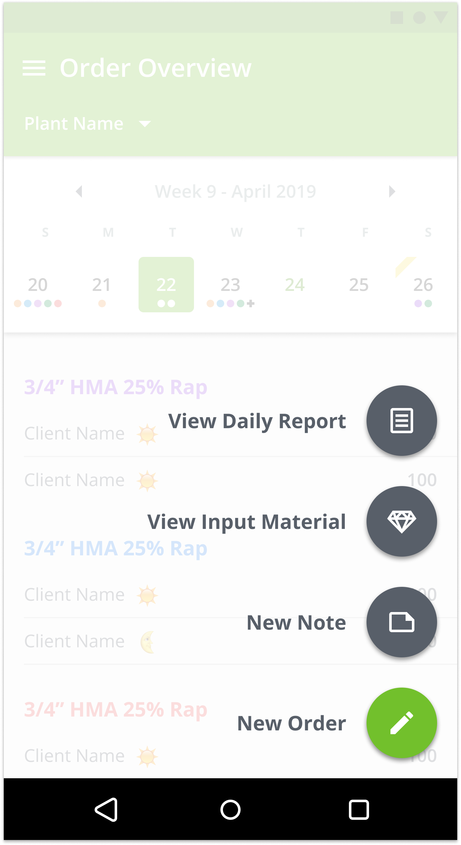
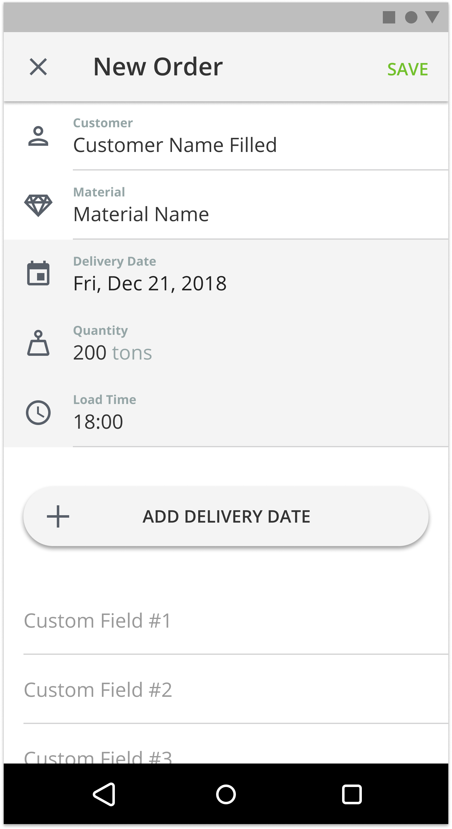
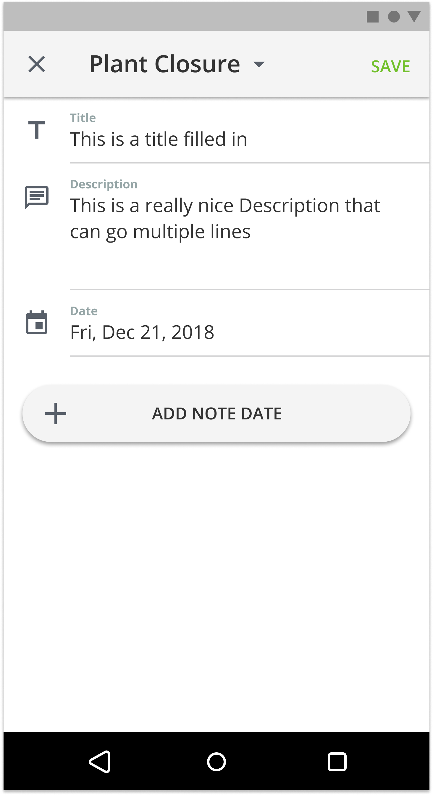
Adding order for responsive web, Android & iOS
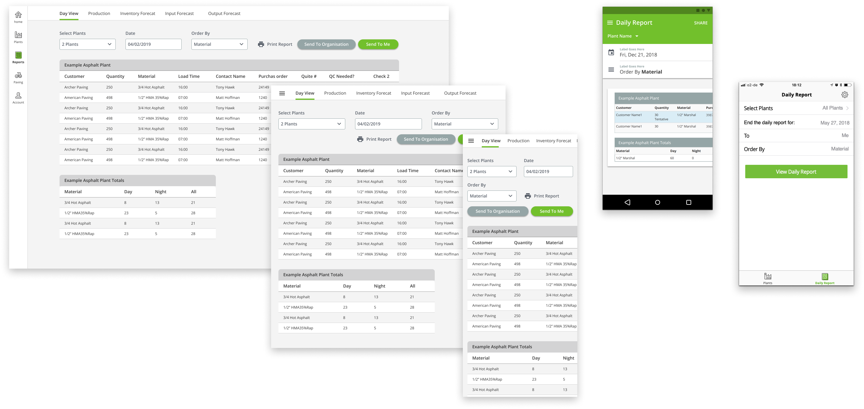
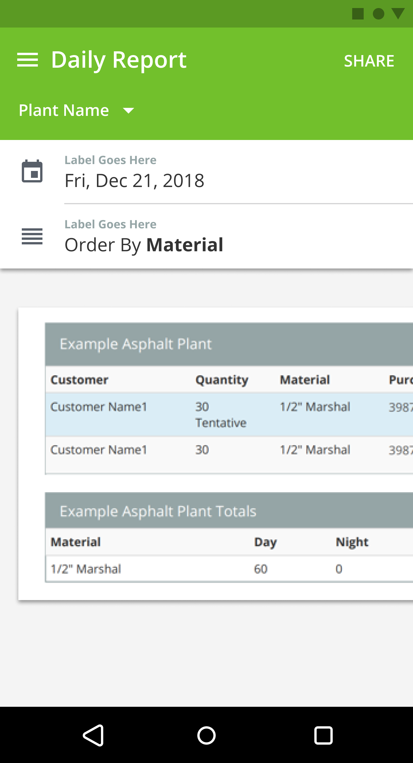
Day report for responsive web, Android & iOS
Light Rebranding
I’m not often dipping my toes into branding, however, I felt it was needed here. I gave the logo a fresh new look. Not trying to reinvent the wheel, just trying to improve the symbolism in the logo. Another point of improvement was the typography and improve legibility on smaller printouts. Another good example of where I try to let the brand shine is in some of the custom icons. Colorful, playful yet to the point.
System thinking
In order to keep everything consistent and neatly organized I created a component library based on atomic design. By doing this it became much easier for me to be consistent with the use of styles, margins across platforms, typography and Icons. By using the instance’s option in Figma I reduce the ripple effect of small changes that impact every screen. Have a look at the Figma file to see how it’s structured.
Validating
Prototyping
By now we’ve defined clear opportunity areas based on existing data and feature requests. We’ve restructured the IA and did initial sketches to improve the navigation model and applied a visual design direction we were all happy with. It was time to put it to the test and validate the design decisions with the customers. First off I build a prototype in Figma. The prototype page uses just Instances of screens so that the prototype updates automatically whenever I make any change to the design
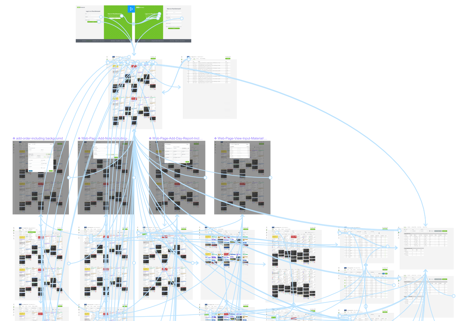
The Figma prototype. Every screen is an instance so it updates automatically when I make any changes in the design.
User Testing
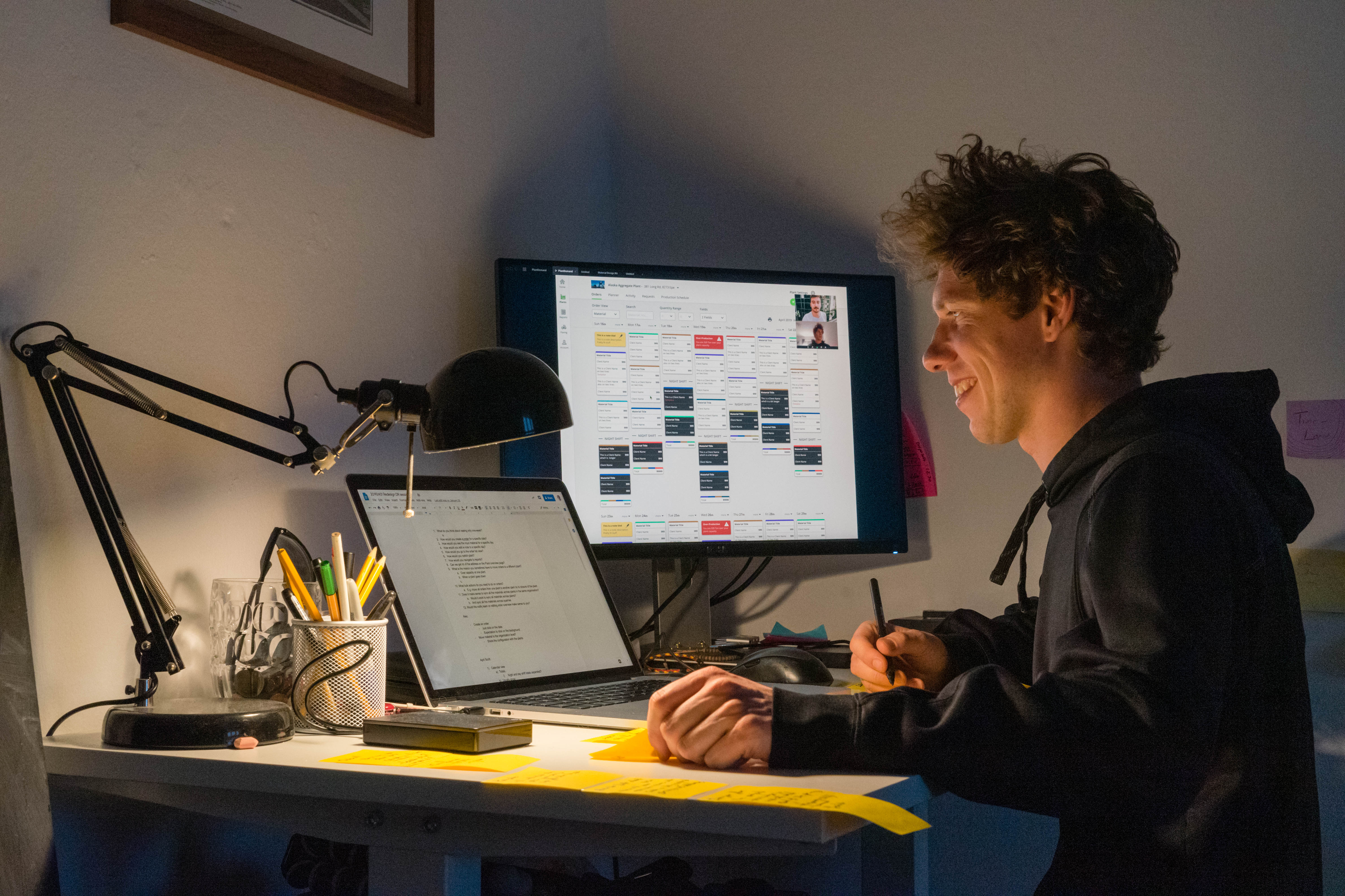
I do the remote user testing through sessions using zoom and the Figma prototype. I prepare a script depending on what we want to validate. We dial in the customer and give them remote access via Zoom and have them use the prototype while I ask the questions. We do these sessions continually at least once a week.
We Collect
Quotes
Pain Points
Feature Requests
We Synthesize
Cluster
Prioritize
We Implement
Adjust Design
Update Script
Repeat
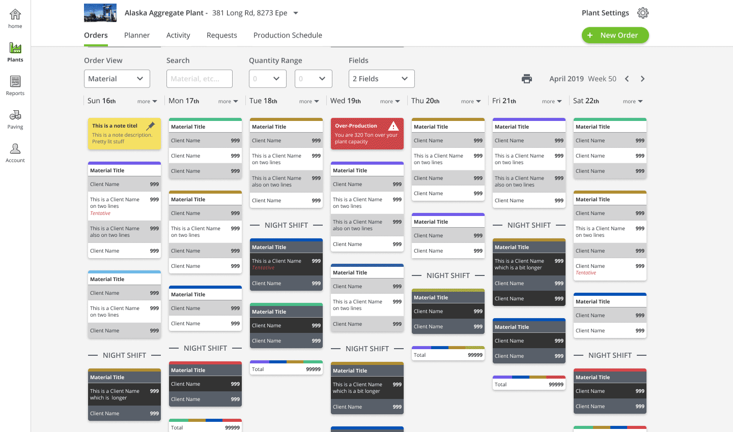
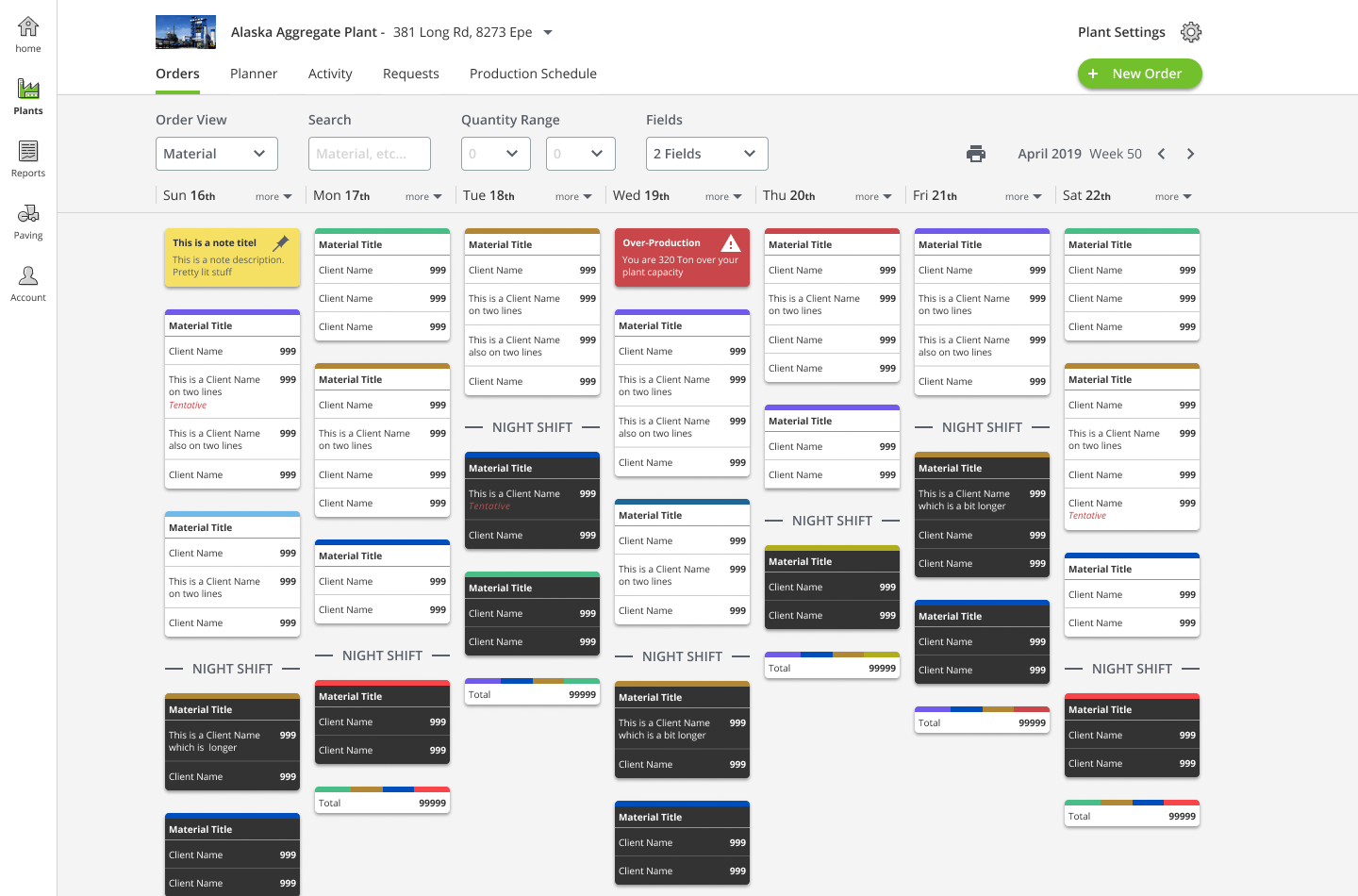
Outcome
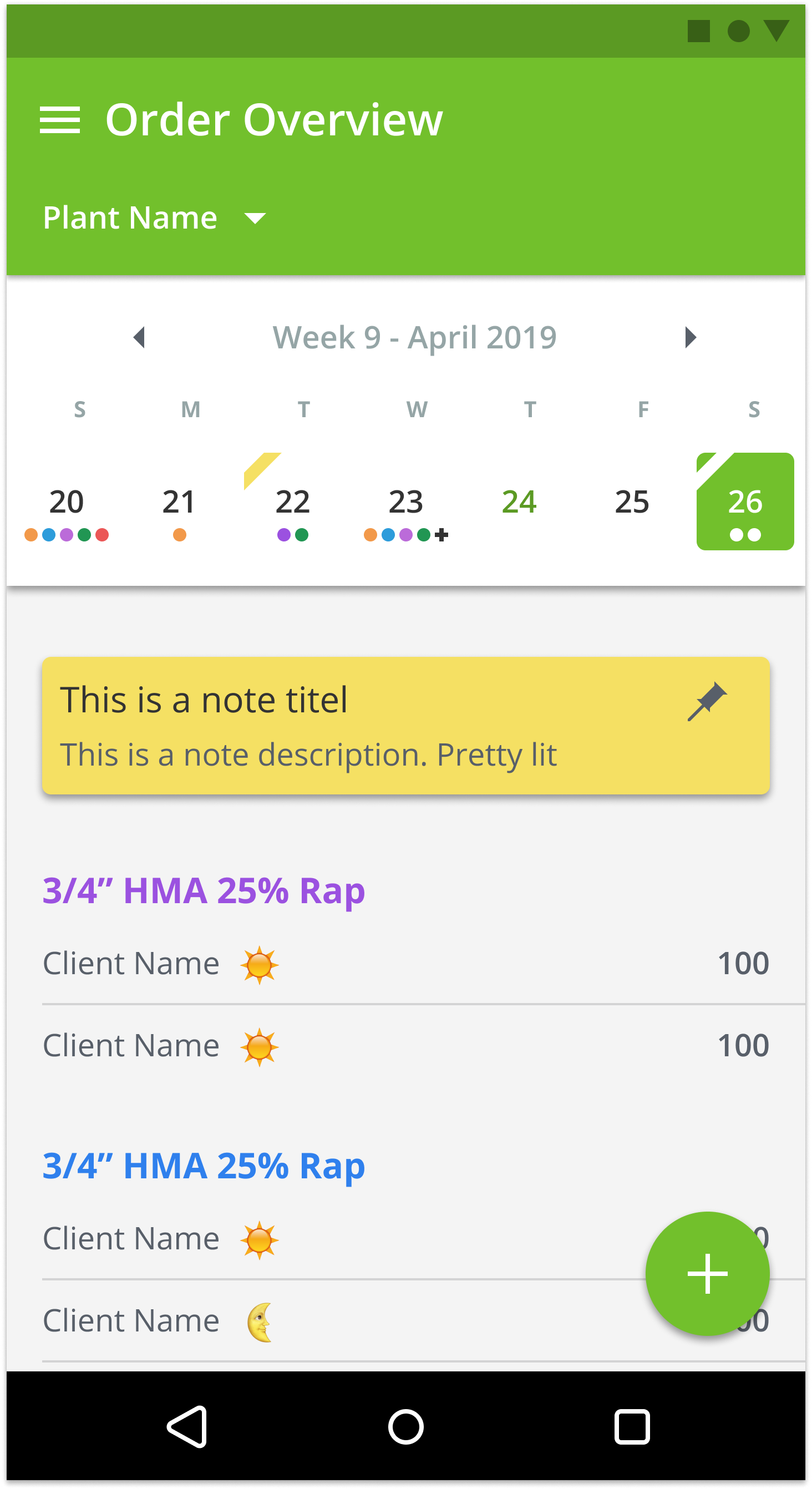
So how did all of this work impact the design? Below you can find the order overview, which is one of the main screens of PlantDemand, with annotations of all the improvements. Obviously, there are a lot more screens (adding orders and viewing reports, settings, etc.) but this page gives a clear overview of some of the high impact changes. If you want to see an overview of all the pages you can go here, and have a look at the Figma file.
And now what?
As with any product, it is never finished. From the design side, I have re-designed around half of the existing features. (there are many more on the backlog) A third party company is busy building our Android app and another company is helping us role out the first scope of the web redesign. My role is now jumping between QA the work that they produce and answer any questions they have around my designs. I am still designing new features to complete the web redesign. And we keep doing user tests to validate the designs before we have them build.
PlantDemand is one of my favorite and most challenging projects because of the team size and the pro-active attitude it takes to push things through. Nobody is telling us what to do. We are our own stakeholders. We communicate with each other and our customers, define priority and we execute. It has the perfect structure for me to practice my interaction design, visual design, user testing, communicating my designs, scoping and at times even front-end skills. It’s a lot, but it’s a lot of fun!